
Developing a Modern Admin Portal with React, Redux, and Ant Design (Part-1)
Getting Started
In this series I would like to share a step by step guide for developing high quality admin portals with React and Ant Design. I will share reusable generic components that will fasten the ground up development. In order to focus on the certain aspects, I divided it to multiple parts.
In this part I present the steps for preparing React and necessary modules, and then, gradually show the implementation of each separate component to build up the Admin Portal. If you like to see the complete code I committed in the following public repository:
 turkogluc
I use the Ant Design as the user interface design framework as it contains a set of high quality components and ready to use demos for building rich, interactive user interfaces. The list of Ant Design react components can be found in the following link:

Initializing the React project
We can use the following boilerplate code as it already contains React 16, Webpack 4 with babel 7, the webpack-dev-server, react-hot-loader and CSS-Modules:
git clone https://github.com/HashemKhalifa/webpack-react-boilerplate.git
mv webpack-react-boilerplate react-admin-portal
cd react-admin-portal
yarn install
yarn start
This repository is maintained continuously and the dependencies are upgraded. So it is good starting point as the most of the environment is already prepared and the technologies are up to date.
The web application starts at http://localhost:8080 address.
Installing Ant Design
yarn add antd
yarn add babel-plugin-import
yarn add less-loader
yarn add less
While using antd, we can either import the complete style file in our root file, or add styling only for the used components which is better in terms of performance. That's why we added babel-plugin-import module and we will update the webpack configuration to import less styles as follows:
Add antd library option in babel-loader rule in webpack-common.js:
{
  test: /\.(js|jsx)$/,
  loader: 'babel-loader',
  exclude: /(node_modules)/,
  options: {
    presets: ['@babel/react'],
    plugins: [['import', { libraryName: 'antd', style: true }]],
  },
},In the same file add also .less to the extensions:
extensions: ['*', '.js', '.jsx', '.css', '.scss', '.less'],Add less-loader to the webpack-dev.js:
{
	test: /\.less$/,
	use: [
		'style-loader',
		'css-loader',
		'sass-loader',
		{
            loader: 'less-loader',
            options: {
              lessOptions: {
                javascriptEnabled: true,
              },
            },
		},
	],
},You can find these changes in the commit 6f0001f.
Installing Redux
yarn add @reduxjs/toolkit
yarn add react-redux
yarn add redux-logger
Let's create our first reducer just as an example:
const INITIAL_STATE = {};

export default (state = INITIAL_STATE, action) => {
  switch (action.type) {
    default:
      return state;
  }
};And add this reducer to global reducers list:
import { combineReducers } from 'redux';
import initReducer from './initReducer';

export default combineReducers({
  initReducer,
});Now we can create our store:
import { createLogger } from 'redux-logger';
import { applyMiddleware, createStore } from 'redux';
import thunkMiddleware from 'redux-thunk';
import reducer from './reducer';

const loggerMiddleware = createLogger();

export const store = createStore(
  reducer,
  applyMiddleware(thunkMiddleware, loggerMiddleware)
);And wrap the App component with Provider:
function App() {
  return (
    <Provider store={store}>
      Hello world
    </Provider>
  );
}See the commit for changes: 98dd23b.
Installing React Router
yarn add react-router-domLet's create browser history:
import { createBrowserHistory } from 'history';

export default createBrowserHistory();We can create an empty dashboard page as the initial page in the routing list.
import React from 'react';

function Dashboard() {
  return <div>Dashboard Page</div>;
}

export default Dashboard;Now we can create Routing list that will contain the path and the component mapping. routes variable contains the list of path component mapping. Dashboard Page is be added as the first path and the root path (/).
import React from 'react';
import { Route } from 'react-router-dom';
import Dashboard from '../page/dashboard/Dashboard';

const routes = [
  {
    path: '/',
    component: Dashboard,
    key: '/',
  },
];

function RoutingList() {
  return routes.map(item => {
    if (item.path.split('/').length === 2) {
      return (
        <Route
          exact
          path={item.path}
          component={item.component}
          key={item.key}
        />
      );
    }
    return <Route path={item.path} component={item.component} key={item.key} />;
  });
}

export default RoutingList;And we can wrap the App component with BrowserRouter. So the App component becomes as follows:
import React from 'react';
import { hot } from 'react-hot-loader/root';
import { Provider } from 'react-redux';
import { BrowserRouter, Switch } from 'react-router-dom';
import { store } from './redux/store';
import history from './router/history';
import MainLayout from './page/layout/MainLayout';

function App() {
  return (
    <Provider store={store}>
      <BrowserRouter history={history}>
        <Switch>
          <MainLayout />
        </Switch>
      </BrowserRouter>
    </Provider>
  );
}
export default hot(App);I have added another empty component which is MainLayout. It is the component that will contain the structure of the layout.
See the commit for changes: 7afcd0c.
Designing the Layout
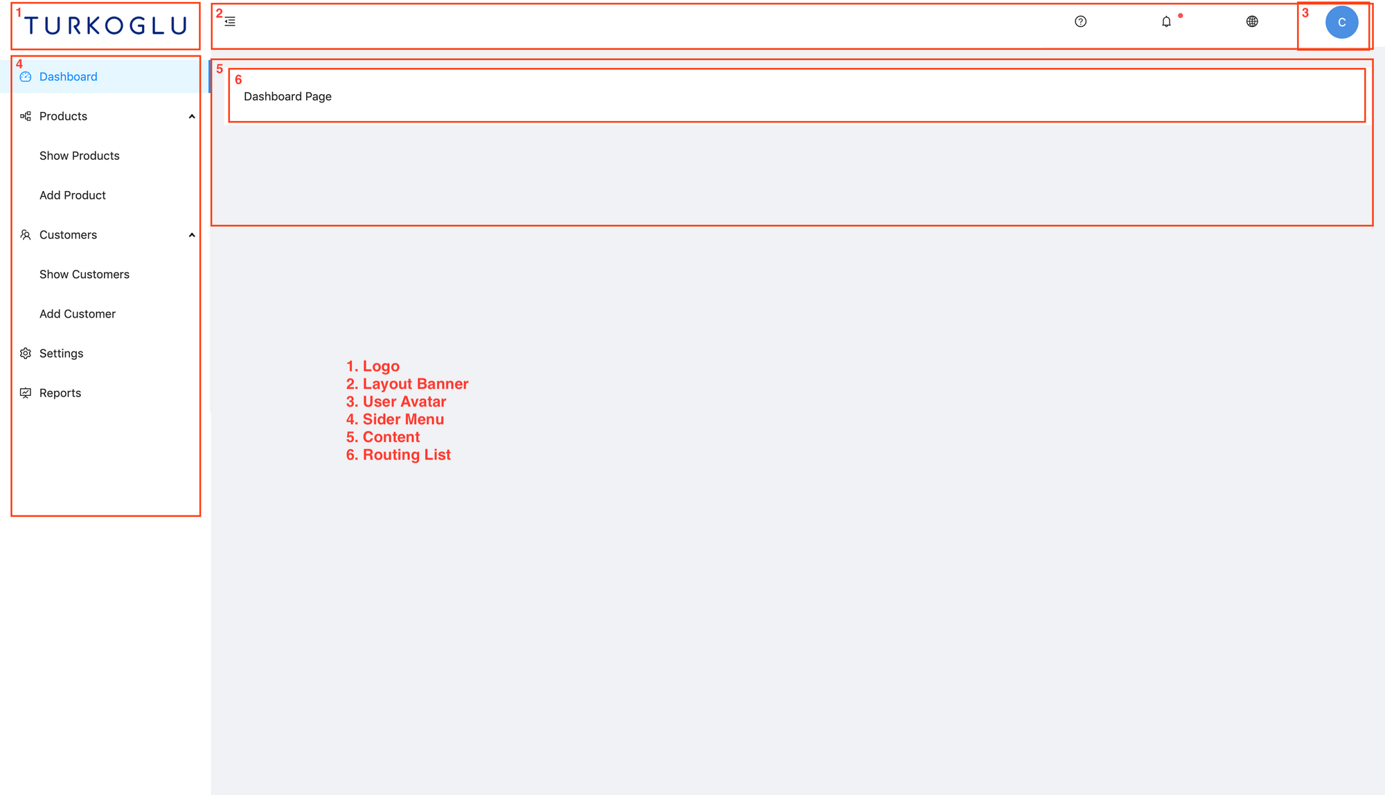
MainLayout component contains sider menu on the left header at the top and the content in the middle. Content part will be controller by the Router. We will place <RoutingList /> component in the content place so that we can to change the content by routing different paths. See the structures of the mentioned components in the next picture.
Let's see the implementation of each component in details.
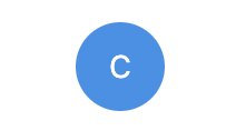
User Avatar Component
I use Ant Design Avatar component in order to represent User Avatar based on the users first name.
import React from 'react';
import { Avatar } from 'antd';

function getColor(username) {
  const colors = [
    '#ffa38a',
    '#a9a7e0',
    '#D686D4',
    '#96CE56',
    '#4A90E2',
    '#62b3d0',
    '#ef7676',
  ];
  const firstChar = username.charCodeAt(0);
  const secondChar = username.charCodeAt(1);
  const thirdChar = username.charCodeAt(2);

  return colors[(firstChar + secondChar + thirdChar) % 7];
}

export const getUsernameAvatar = (username, size = 'large') => {
  return (
    <div>
      <Avatar
        style={{
          backgroundColor: getColor(username),
          verticalAlign: 'middle',
        }}
        size={size}
      >
        {username ? username.charAt(0).toUpperCase() : ''}
      </Avatar>
    </div>
  );
};It looks as follows:
Layout Banner Component
It is the header component in the layout that contains some horizontal menus from Ant Design such as user menu, language switcher etc.
import React from 'react';
import {
  MenuUnfoldOutlined,
  MenuFoldOutlined,
  QuestionCircleOutlined,
  GlobalOutlined,
  BellOutlined,
  UserOutlined,
  LogoutOutlined,
} from '@ant-design/icons';
import { Layout, Menu, Badge } from 'antd';
import './Style.less';
import { getUsernameAvatar } from '../../component/UserAvatar';

const { Header } = Layout;
const { SubMenu } = Menu;

function LayoutBanner({ collapsed, handleOnCollapse }) {
  const getCollapseIcon = () => {
    if (collapsed) {
      return (
        <MenuUnfoldOutlined onClick={handleOnCollapse} className="trigger" />
      );
    }
    return <MenuFoldOutlined onClick={handleOnCollapse} className="trigger" />;
  };

  const handleLanguageMenuClick = () => {};
  const handleSettingMenuClick = () => {};
  const handleLogout = () => {};

  return (
    <Header className="header" style={{ background: '#fff', padding: 0 }}>
      <div
        style={{
          float: 'left',
          width: '100%',
          alignSelf: 'center',
          display: 'flex',
        }}
      >
        {window.innerWidth > 992 && getCollapseIcon()}
      </div>
      <Menu
        // onClick={this.handleLanguageMenuClick}
        mode="horizontal"
        className="menu"
      >
        <SubMenu title={<QuestionCircleOutlined />} />
      </Menu>
      <Menu
        // onClick={this.handleLanguageMenuClick}
        mode="horizontal"
        className="menu"
      >
        <SubMenu
          title={
            <Badge dot>
              <BellOutlined />
            </Badge>
          }
        />
      </Menu>
      <Menu
        onClick={handleLanguageMenuClick}
        mode="horizontal"
        className="menu"
      >
        <SubMenu title={<GlobalOutlined />}>
          <Menu.Item key="en">
            <span role="img" aria-label="English">
              🇺🇸 English
            </span>
          </Menu.Item>
          <Menu.Item key="it">
            <span role="img" aria-label="Italian">
              🇮🇹 Italian
            </span>
          </Menu.Item>
        </SubMenu>
      </Menu>
      <Menu onClick={handleSettingMenuClick} mode="horizontal" className="menu">
        <SubMenu title={getUsernameAvatar('Cemal')}>
          <Menu.Item key="setting:1">
            <span>
              <UserOutlined />
              Profile
            </span>
          </Menu.Item>
          <Menu.Item key="setting:2">
            <span>
              <LogoutOutlined onClick={handleLogout} />
              Logout
            </span>
          </Menu.Item>
        </SubMenu>
      </Menu>
    </Header>
  );
}

export default LayoutBanner;
Adding styles:
.header {
  display: flex;
}

.trigger {
  margin-left: 16px;
  margin-right: 16px;
  align-self: center;

}

.menu {
  .ant-menu-horizontal {
    & > .ant-menu-submenu {
      float: right;
    }
    border: none;
  }
  box-shadow: #e4ecef;
  position: relative;
  .ant-menu-submenu-title {
    width: 64px;
    height: 64px;
    text-align: center;
    padding-top: 8px;
  }
}So it looks as follows:

Sider Menu Component
This component uses Sider, Menu, Icon components of Ant Design.
import React from 'react';
import { Layout, Menu } from 'antd';
import { useHistory } from 'react-router-dom';
import {
  DashboardOutlined,
  FundProjectionScreenOutlined,
  PartitionOutlined,
  SettingOutlined,
  TeamOutlined,
} from '@ant-design/icons';
import './Style.less';

const { SubMenu } = Menu;

const { Sider } = Layout;

function SiderMenu({ handleOnCollapse, collapsed }) {
  const theme = 'light';

  const history = useHistory();

  const handleSiderMenuClick = action => {
    console.log('menu:', action);
    switch (action.key) {
      case 'dashboard':
        history.push('/');
        break;
      case 'showProducts':
        history.push('/products');
        break;
      case 'addProduct':
        history.push('/add-product');
        break;
      case 'showCustomers':
        history.push('/customers');
        break;
      case 'addCustomer':
        history.push('/add-customer');
        break;
      default:
        history.push('/');
    }
  };

  return (
    <Sider
      breakpoint="lg"
      collapsedWidth="80"
      onCollapse={handleOnCollapse}
      collapsed={collapsed}
      width="256"
      theme={theme}
    >
      <a>
        <div className="menu-logo" />
      </a>
      <Menu mode="inline" theme={theme} onClick={handleSiderMenuClick}>
        <Menu.Item key="dashboard">
          <DashboardOutlined />
          <span className="nav-text">Dashboard</span>
        </Menu.Item>
        <SubMenu
          key="products"
          title={
            <span>
              <PartitionOutlined />
              <span>Products</span>
            </span>
          }
        >
          <Menu.Item key="showProducts">
            <span className="nav-text">Show Products</span>
          </Menu.Item>
          <Menu.Item key="addProduct">
            <span className="nav-text">Add Product</span>
          </Menu.Item>
        </SubMenu>
        <SubMenu
          key="customers"
          title={
            <span>
              <TeamOutlined />
              <span>Customers</span>
            </span>
          }
        >
          <Menu.Item key="showCustomers">
            <span className="nav-text">Show Customers</span>
          </Menu.Item>
          <Menu.Item key="addCustomer">
            <span className="nav-text">Add Customer</span>
          </Menu.Item>
        </SubMenu>
        <Menu.Item key="settings">
          <SettingOutlined />
          <span className="nav-text">Settings</span>
        </Menu.Item>
        <Menu.Item key="reports">
          <FundProjectionScreenOutlined />
          <span className="nav-text">Reports</span>
        </Menu.Item>
      </Menu>
    </Sider>
  );
}

export default SiderMenu;We can add a logo above the sider menu, within the less style file.
.menu-logo {
  background-image: url('../../../public/icon.png');
  background-repeat: no-repeat;
  background-position: center;
  height: 35px;
  background-size: 100%;
  margin: 20px;
  color: #ffffff;
}Main Layout Component
Main Layout component contains the Layout and Content of Ant Design. Layout wraps the entire body, our custom SiderMenu is placed on the left and LayoutBanner stands above the content. RoutingList component is added within the Content. React Router will render the route at this place.
import React, { useState } from 'react';
import { Layout } from 'antd';
import SiderMenu from './SiderMenu';
import LayoutBanner from './LayoutBanner';
import './Style.less';
import RoutingList from '../../router/RoutingList';

const { Content } = Layout;

function MainLayout() {
  const [collapsed, setCollapsed] = useState(false);

  const handleOnCollapse = () => {
    setCollapsed(prevState => !prevState);
  };

  return (
    <Layout style={{ minHeight: '100vh' }}>
      <SiderMenu collapsed={collapsed} handleOnCollapse={handleOnCollapse} />
      <Layout>
        <LayoutBanner
          collapsed={collapsed}
          handleOnCollapse={handleOnCollapse}
        />
        <Content style={{ margin: '24px 16px 0' }}>
          <div style={{ padding: 24, background: '#fff', minHeight: 20 }}>
            <RoutingList />
          </div>
        </Content>
      </Layout>
    </Layout>
  );
}

export default MainLayout;See the commit for changes: 229b776.
Adding New Pages/Routes
We create new components, with a simple content:
function ShowCustomers() {
  return <div>Customer Page</div>;
}

function ShowProducts() {
  return <div>Product Page</div>;
}
And we can add new routes to the RoutingList component as follows:
const routes = [
  {
    path: '/',
    component: Dashboard,
    key: '/',
  },
  {
    path: '/customers',
    component: ShowCustomers,
    key: '/customers',
  },
  {
    path: '/products',
    component: ShowProducts,
    key: '/products',
  },
];In the SiderMenu click action sends these paths for the clicked keys:
case 'showProducts':
	history.push('/products');
	break;

case 'showCustomers':
    history.push('/customers');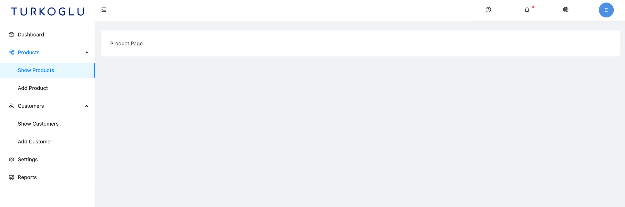
break;Now clicking Show Products renders the ShowProducts component within the content area.
See the commit for changes: 4c52d5b.