
Developing a Modern Admin Portal with React, Redux, and Ant Design (Part-2)
In the part-1, I demonstrated the implementation of Main Layout of the Admin Panel. In this part I will show some generic components that can be used in the content part of the layout, such as tables, forms, charts.
Header Component
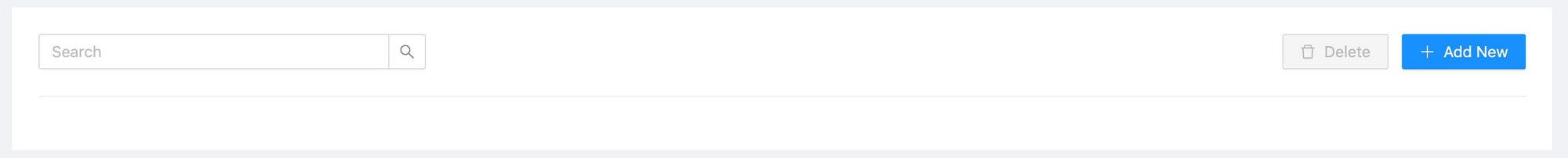
We can define a generic component that can be used as the header above the table views. It contains a search bar, add new and delete buttons and looks like as follows:
import React from 'react';
import { Button, Col, Divider, Input, Popconfirm, Row } from 'antd';
import {
  DeleteOutlined,
  PlusOutlined,
  QuestionCircleOutlined,
} from '@ant-design/icons';
import { useHistory } from 'react-router-dom';

const { Search } = Input;

function Header({ addNewPath, hasSelected, handleSearch }) {
  const history = useHistory();

  const handleAddNew = () => {
    history.push('/' + addNewPath);
  };

  return (
    <>
      <Row>
        <Col>
          <Search
            placeholder="Search"
            onSearch={handleSearch}
            allowClear
            style={{ float: 'left', width: 350 }}
          />
        </Col>
        <Col flex="auto">
          <Button
            icon={<PlusOutlined />}
            type="primary"
            style={{ float: 'right' }}
            onClick={handleAddNew}
          >
            Add New
          </Button>

          <Button
            icon={<DeleteOutlined />}
            disabled={!hasSelected}
            style={{ float: 'right', marginRight: 12 }}
          >
            <Popconfirm
              title="Sure to delete?"
              icon={<QuestionCircleOutlined style={{ color: 'red' }} />}
              onConfirm={() => {}}
            >
              Delete
            </Popconfirm>
          </Button>
        </Col>
      </Row>
      <Divider />
    </>
  );
}

export default Header;Now we can add the Header component in the pages, for example in the product page:
import React, { useState } from 'react';
import Header from '../../component/Header';

function ShowProducts() {
  const [hasSelected, setHasSelected] = useState(false);

  return (
    <>
      <Header addNewPath="add-product" hasSelected={hasSelected} />
    </>
  );
}

export default ShowProducts;See the commit for changes: 5c6f738
DataTable Component
Ant design has a Table component with a wide variety of features as selectable rows, pagination, rendering custom columns, handling user events on the table. However, using it in each page causes duplicate code. Therefore we can create our custom ho0k in order to use tables. So the table hook is as follows:
import React, { useState } from 'react';
import { Table } from 'antd';
import useActionMenu from './ActionMenu';

const DEFAULT_PAGE_SIZE = 10;
const DEFAULT_PAGE_NUMBER = 0;

function useDataTable({ columns, dataSource, updateEntityPath }) {
  const [selectedRowKeys, setSelectedRowKeys] = useState([]);
  const [selectedRow, setSelectedRow] = useState(null);
  const [currentPage, setCurrentPage] = useState(DEFAULT_PAGE_NUMBER);
  const [pageSize, setPageSize] = useState(DEFAULT_PAGE_SIZE);
  const [actionColumnView] = useActionMenu({ selectedRow, updateEntityPath });

  const hasSelected = selectedRowKeys.length > 0;

  const rowSelection = {
    selectedRowKeys,
    onChange: selected => {
      setSelectedRowKeys(selected);
    },
  };

  const updatedColumns = [
    ...columns,
    {
      title: 'Action',
      key: 'action',
      render: () => actionColumnView,
    },
  ];

  const handleSingleDelete = () => {
    console.log('handleSingleDelete, selected:', selectedRow);
  };

  const resetPagination = () => {
    setCurrentPage(DEFAULT_PAGE_NUMBER);
  };

  const handleTableChange = pagination => {
    console.log('pagination:', pagination);
    setCurrentPage(pagination.current - 1);
  };

  const DataTable = () => (
    <Table
      rowKey={record => record.id}
      rowSelection={rowSelection}
      columns={updatedColumns}
      dataSource={dataSource.content}
      onRow={record => {
        return {
          onClick: () => {
            setSelectedRow(record);
          },
        };
      }}
      onChange={handleTableChange}
      pagination={{
        pageSize: DEFAULT_PAGE_SIZE,
        current: currentPage + 1,
        total: dataSource.totalElements,
        showTotal: (total, range) => {
          return `${range[0]}-${range[1]} of ${total} items`;
        },
      }}
    />
  );

  return {
    DataTable,
    hasSelected,
    selectedRow,
    selectedRowKeys,
    currentPage,
    pageSize,
    resetPagination,
  };
}

export default useDataTable;
It returns:
DataTablecomponent that represents the tablehasSelectedboolean value for any columns selectedselectedRowis the single row which is at last selectedselectedRowKeysis the array containing multiple selected keyscurrentPage,pageSizeandresetPaginationfor the pagination
These values can be used in the component that is wrapping the table. We are also adding an action column at the end of column list to display update and delete actions. This view is also implemented as a custom hook in the ActionMenu file as follows:
import React from 'react';
import { Dropdown, Menu, Popconfirm } from 'antd';
import {
  DeleteOutlined,
  DownOutlined,
  EditOutlined,
  QuestionCircleOutlined,
} from '@ant-design/icons';
import { useHistory } from 'react-router-dom';

function useActionMenu({ selectedRow, updateEntityPath }) {
  const history = useHistory();

  const handleMenuClick = (action) => {
    if (action.key === 'edit') {
      const updatePath = '/' + updateEntityPath + '/' + selectedRow.id;
      history.push(updatePath);
    }
  };

  const handleSingleDelete = () => {
    console.log('handleSingleDelete, selected:', selectedRow);
  };

  const actionMenu = (
    <Menu onClick={handleMenuClick}>
      <Menu.Item key="edit">
        <EditOutlined />
        Update
      </Menu.Item>
      <Menu.Item key="delete">
        <Popconfirm
          title="Sure to delete?"
          placement="left"
          icon={<QuestionCircleOutlined style={{ color: 'red' }} />}
          onConfirm={handleSingleDelete}
        >
          <DeleteOutlined type="delete" />
          Delete
        </Popconfirm>
      </Menu.Item>
    </Menu>
  );

  const actionColumnView = (
    <span>
      <Dropdown overlay={actionMenu} trigger={['click']}>
        <a className="ant-dropdown-link" href="#">
          Actions <DownOutlined />
        </a>
      </Dropdown>
    </span>
  );

  return [actionColumnView];
}

export default useActionMenu;
Now we can use the table hook in the pages for example in product page:
import React from 'react';
import Header from '../../component/Header';
import useDataTable from '../../component/DataTable';
import * as constants from './Constants';

function ShowProducts() {
  const {
    DataTable,
    hasSelected,
    currentPage,
    pageSize,
    resetPagination,
  } = useDataTable({
    columns: constants.columns,
    dataSource: constants.data,
    updateEntityPath: 'update-product',
  });

  return (
    <>
      <Header addNewPath="add-product" hasSelected={hasSelected} />
      <DataTable />
    </>
  );
}

export default ShowProducts;
Columns and DataSource to table is defined in a constant file as follows:
import React from 'react';
import { Tag } from 'antd';

export const columns = [
  {
    title: 'Id',
    dataIndex: 'key',
    key: 'key',
  },
  {
    title: 'Name',
    dataIndex: 'name',
    key: 'name',
    render: text => <a>{text}</a>,
  },
  {
    title: 'Description',
    dataIndex: 'description',
    key: 'description',
  },
  {
    title: 'Quantity',
    dataIndex: 'qty',
    key: 'qty',
  },
  {
    title: 'owner',
    dataIndex: 'owner',
    key: 'owner',
  },
  {
    title: 'Category',
    key: 'category',
    dataIndex: 'category',
    render: tags => (
      <>
        {tags.map(tag => {
          let color = 'blue';
          if (tag === 'accessory') {
            color = 'volcano';
          } else if (tag === 'clothing') {
            color = 'geekblue';
          } else if (tag === 'jewellery') {
            color = 'green';
          }
          return (
            <Tag color={color} key={tag}>
              {tag.toUpperCase()}
            </Tag>
          );
        })}
      </>
    ),
  },
];

export const data = {
  totalElements: 8,
  content: [
    {
      key: '1',
      name: 'Personalized Bar Bracelet',
      description: 'This is a metal bracelet',
      qty: 32,
      owner: 'John Brown',
      category: ['jewellery', 'accessory'],
    },
    {
      key: '2',
      name: 'Handcraft Boots',
      description: 'Vegan-friendly leather',
      qty: 12,
      owner: 'John Green',
      category: ['clothing', 'living'],
    },
    {
      key: '3',
      name: 'Personalized Bar Bracelet',
      description: 'This is a metal bracelet',
      qty: 32,
      owner: 'John Brown',
      category: ['jewellery', 'clothing'],
    },
    // ...
  ],
};
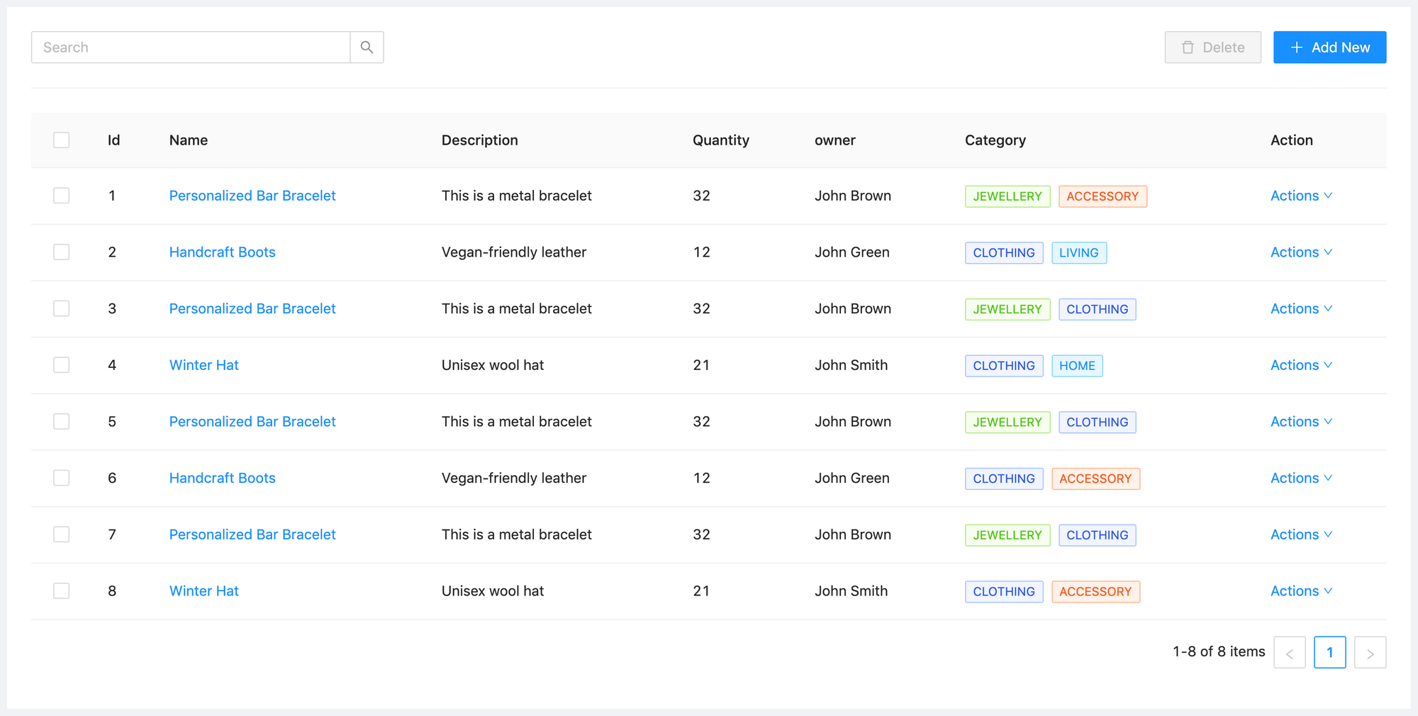
Of course the data variable is a mock here and in real life applications it is supposed to be retrieved from backend by API calls. So the table view becomes as follows:
See the commit for changes: 1694602
Add New Item with Forms
Ant Design has the feature rich Form component that handles most of the work and design hassle for us. I will demonstrate a save product page using Antd Form.
import React from 'react';
import {
  Switch,
  Card,
  Form,
  Input,
  Row,
  Col,
  Select,
  Divider,
  Button,
  InputNumber,
} from 'antd';
import { CheckOutlined, CloseOutlined } from '@ant-design/icons';

const { Option } = Select;

function AddProduct() {
  const [form] = Form.useForm();

  const handleSave = values => {
    console.log('onFinish', values);
    // call save API
  };

  const requiredFieldRule = [{ required: true, message: 'Required Field' }];

  const ownerArray = [
    {
      id: 1,
      value: 'John Nash',
    },
    {
      id: 2,
      value: 'Leonhard Euler',
    },
    {
      id: 3,
      value: 'Alan Turing',
    },
  ];

  const categoryArray = [
    {
      id: 1,
      value: 'Clothing',
    },
    {
      id: 2,
      value: 'Jewelery',
    },
    {
      id: 3,
      value: 'Accessory',
    },
  ];

  return (
    <Card title="Add Product" loading={false}>
      <Row justify="center">
        <Col span={12}>
          <Form
            labelCol={{ span: 4 }}
            wrapperCol={{ span: 16 }}
            form={form}
            name="product-form"
            onFinish={handleSave}
          >
            <Form.Item label="Name" name="name" rules={requiredFieldRule}>
              <Input />
            </Form.Item>
            <Form.Item label="Description" name="description">
              <Input />
            </Form.Item>
            <Form.Item label="Owner" name="owner">
              <Select>
                {ownerArray.map(item => (
                  <Option key={item.id} value={item.id}>
                    {item.value}
                  </Option>
                ))}
              </Select>
            </Form.Item>
            <Form.Item label="Category" name="category">
              <Select>
                {categoryArray.map(item => (
                  <Option key={item.id} value={item.id}>
                    {item.value}
                  </Option>
                ))}
              </Select>
            </Form.Item>
            <Form.Item label="Quantity" name="qty">
              <InputNumber />
            </Form.Item>
            <Form.Item
              label="Status"
              name="active"
              valuePropName="checked"
              initialValue={false}
            >
              <Switch
                checkedChildren={<CheckOutlined />}
                unCheckedChildren={<CloseOutlined />}
              />
            </Form.Item>
            <Divider />
            <Row justify="center">
              <Button type="primary" htmlType="submit">
                Save
              </Button>
            </Row>
          </Form>
        </Col>
      </Row>
    </Card>
  );
}

export default AddProduct;
We need to add the new component in the RoutingList as a new route. The Add New button in the Show Product page forwards to the /add-product path.
const routes = [
// ...
{
path: '/add-product',
component: AddProduct,
key: '/add-product',
},
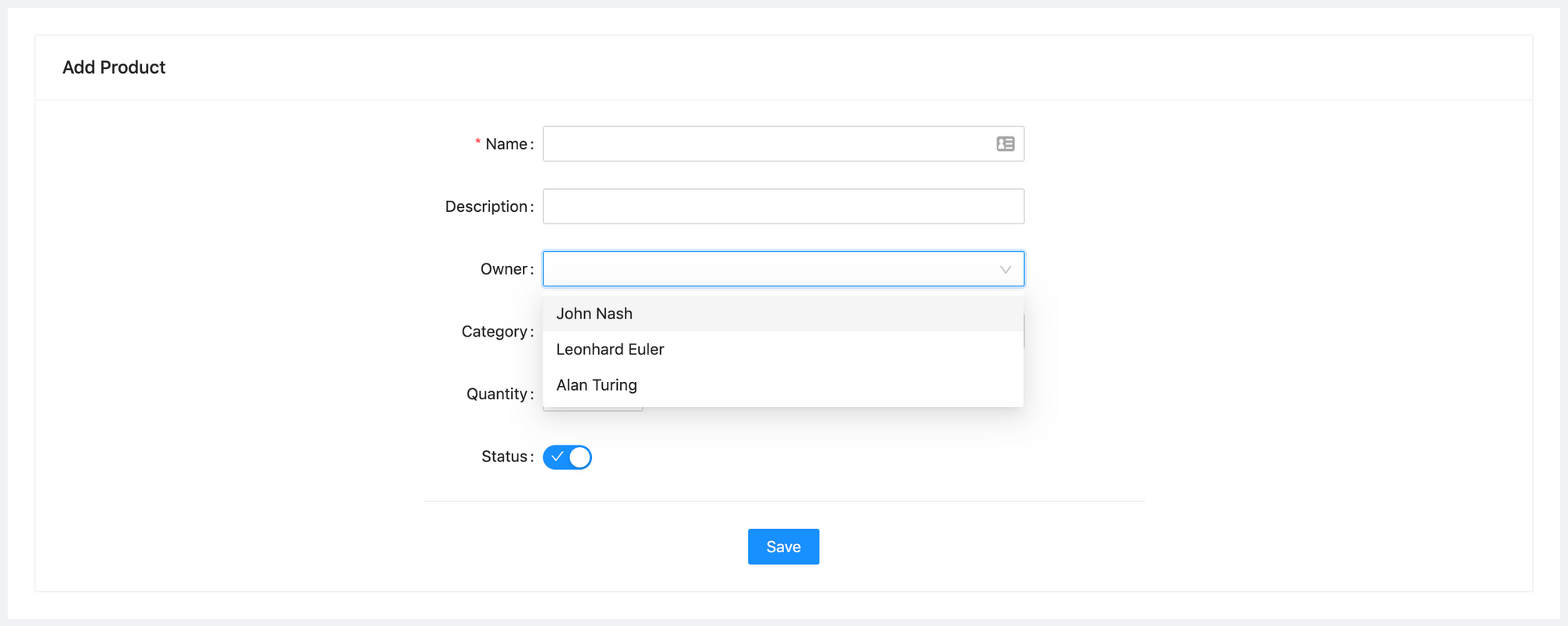
];The view looks like as follows:
See the commit for the changes: 790615.
handleSave method is called when the Save button is clicked and the values parameter contains the json that can be sent to backend save API.
What is Next