
Developing a Modern Admin Portal with React, Redux, and Ant Design (Part-3)
In the part-1, I started with installing the React, dependencies and preparing the environment and showed the implementation of Main Layout of the Admin Panel. I have demonstrated routing in the react with the SiderMenu and Content in the Layout.
In the part-2, I demonstrated using generic components with custom hooks, and created exemplary pages containing the tables in order to list the items, forms for create, update pages, and we designed the pages by invoking the reusable hooks.
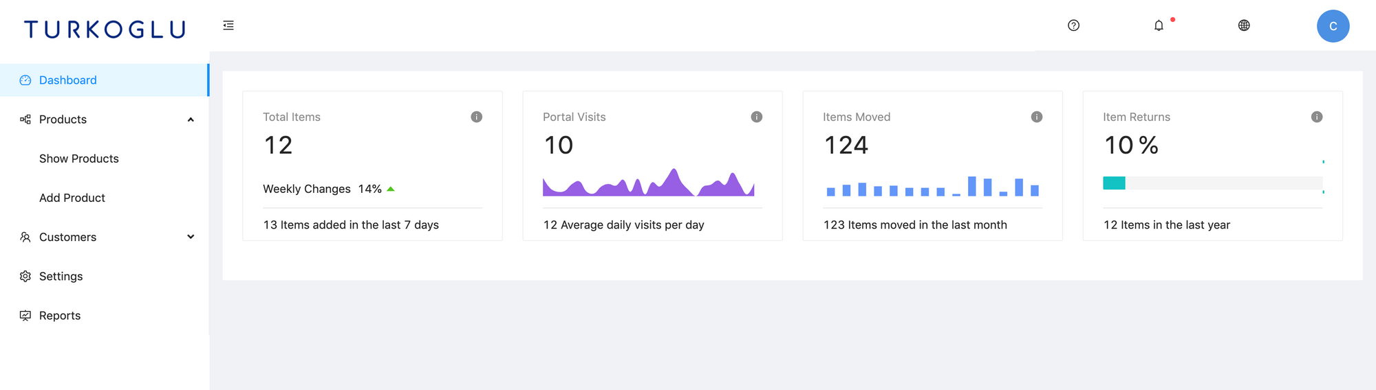
In this part I would like show more visual components by designing the Dashboard page. For charting I use bizcharts, that is a chart component library with wide variety of choice. Thanks to its Example Charts gallery, it is easy to just copy the components and use in our pages.
Designing the Dashboard
We need to start with install the bizcharts library:
yarn add bizchartsChartCard Component
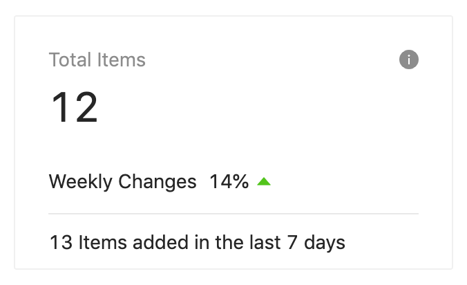
I would like have a Card component that will contain a summary info, and in the size of 1/4 of a row, so that I can add 4 of them in a row and display some tiny bit of information within. It is going to look like as follows:
The component code is as follows:
import React from 'react';
import { Card } from 'antd';
import './ChartCard.less';

function ChartCard(props) {
  const renderContent = () => {
    const {
      contentHeight,
      title,
      avatar,
      action,
      total,
      footer,
      children,
      loading,
    } = props;

    return (
      <div className="chartCard">
        <div className="chartTop">
          <div className="avatar">{avatar}</div>
          <div className="metaWrap">
            <div className="meta">
              <span className="title">{title}</span>
              <span className="action">{action}</span>
            </div>
            <div className="total">{total}</div>
          </div>
        </div>
        {children && (
          <div className="content" style={{ height: contentHeight || 'auto' }}>
            <div className="contentHeight">{children}</div>
          </div>
        )}
        {footer && <div className="footer">{footer}</div>}
      </div>
    );
  };
  return (
    <Card loading={false} bodyStyle={{ padding: '20px 24px 8px 24px' }}>
      {renderContent()}
    </Card>
  );
}

export default ChartCard;
And it has a styling file:
.chartCard {
  position: relative;
  .chartTop {
    position: relative;
    width: 100%;
    overflow: hidden;
  }
  .chartTopMargin {
    margin-bottom: 12px;
  }
  .chartTopHasMargin {
    margin-bottom: 20px;
  }
  .metaWrap {
    float: left;
  }
  .avatar {
    position: relative;
    top: 4px;
    float: left;
    margin-right: 20px;
    img {
      border-radius: 100%;
    }
  }
  .meta {
    height: 22px;
    color: fade(#000, 45%);
    font-size: 14px;
    line-height: 22px;
  }
  .action {
    position: absolute;
    top: 4px;
    right: 0;
    line-height: 1;
    cursor: pointer;
  }
  .total {
    height: 38px;
    margin-top: 4px;
    margin-bottom: 0;
    overflow: hidden;
    color: fade(#000, 85%);
    font-size: 30px;
    line-height: 38px;
    white-space: nowrap;
    text-overflow: ellipsis;
    word-break: break-all;
  }
  .content {
    position: relative;
    width: 100%;
    margin-bottom: 12px;
  }
  .contentFixed {
    position: absolute;
    bottom: 0;
    left: 0;
    width: 100%;
  }
  .footer {
    margin-top: 8px;
    padding-top: 9px;
    border-top: 1px solid hsv(0, 0, 91%);
    & > * {
      position: relative;
    }
  }
  .footerMargin {
    margin-top: 20px;
  }
  .trendText {
    margin-left: 8px;
    margin-right: 4px;
    color: fade(#000, 85%);
  }
  .boldText {
    color: fade(#000, 85%);
  }
}
Mini Charting Components for ChartCard
I would like to add some bar/line charts within the ChartCard to display some visual summary info, but to be able to fit in such a small area, I need to use some styling and autoHeight method.
import React from 'react';

function computeHeight(node) {
  const { style } = node;
  style.height = '100%';
  const totalHeight = parseInt(`${getComputedStyle(node).height}`, 10);
  const padding =
    parseInt(`${getComputedStyle(node).paddingTop}`, 10) +
    parseInt(`${getComputedStyle(node).paddingBottom}`, 10);
  return totalHeight - padding;
}
function getAutoHeight(n) {
  if (!n) {
    return 0;
  }
  const node = n;
  let height = computeHeight(node);
  const { parentNode } = node;
  if (parentNode) {
    height = computeHeight(parentNode);
  }
  return height;
}
function autoHeight() {
  return WrappedComponent => {
    class AutoHeightComponent extends React.Component {
      constructor(props) {
        super(props);
        this.state = {
          computedHeight: 0,
        };
        this.root = undefined;
        this.handleRoot = node => {
          this.root = node;
        };
      }

      componentDidMount() {
        // eslint-disable-next-line react/prop-types
        const { height } = this.props;
        if (!height) {
          let h = getAutoHeight(this.root);
          this.setState({ computedHeight: h });
          if (h < 1) {
            h = getAutoHeight(this.root);
            this.setState({ computedHeight: h });
          }
        }
      }

      render() {
        // eslint-disable-next-line react/prop-types
        const { height } = this.props;
        const { computedHeight } = this.state;
        const h = height || computedHeight;
        return (
          <div ref={this.handleRoot}>
            {/* eslint-disable-next-line react/jsx-props-no-spreading */}
            {h > 0 && <WrappedComponent {...this.props} height={h} />}
          </div>
        );
      }
    }
    return AutoHeightComponent;
  };
}

export default autoHeight;
Some general styling:
.miniChart {
  position: relative;
  width: 100%;
  .chartContent {
    position: absolute;
    bottom: -28px;
    width: 100%;
    > div {
      margin: 0 -5px;
      overflow: hidden;
    }
  }
  .chartLoading {
    position: absolute;
    top: 16px;
    left: 50%;
    margin-left: -7px;
  }
}
MiniArea Component
import React from 'react';
import { Axis, Chart, Geom, Tooltip } from 'bizcharts';
import './chart.less';
import autoHeight from './autoHeight';

function MiniArea(props) {
  const {
    height = 1,
    data = [],
    forceFit = true,
    color = 'rgba(24, 144, 255, 0.2)',
    borderColor = '#1089ff',
    scale = { x: {}, y: {} },
    borderWidth = 2,
    line,
    xAxis,
    yAxis,
    animate = true,
  } = props;

  const padding = [36, 5, 30, 5];

  const scaleProps = {
    x: {
      type: 'cat',
      range: [0, 1],
      ...scale.x,
    },
    y: {
      min: 0,
      ...scale.y,
    },
  };

  const tooltip = [
    'x*y',
    (x, y) => ({
      name: x,
      value: y,
    }),
  ];

  const chartHeight = height + 54;

  return (
    <div className="miniChart" style={{ height }}>
      <div className="chartContent">
        {height > 0 && (
          <Chart
            animate={animate}
            scale={scaleProps}
            height={chartHeight}
            forceFit={forceFit}
            data={data}
            padding={padding}
          >
            <Axis
              key="axis-x"
              name="x"
              label={null}
              line={null}
              tickLine={null}
              grid={null}
              {...xAxis}
            />
            <Axis
              key="axis-y"
              name="y"
              label={null}
              line={null}
              tickLine={null}
              grid={null}
              {...yAxis}
            />
            <Tooltip showTitle={false} crosshairs={false} />
            <Geom
              type="area"
              position="x*y"
              color={color}
              tooltip={tooltip}
              shape="smooth"
              style={{
                fillOpacity: 1,
              }}
            />
            {line ? (
              <Geom
                type="line"
                position="x*y"
                shape="smooth"
                color={borderColor}
                size={borderWidth}
                tooltip={false}
              />
            ) : (
              <span style={{ display: 'none' }} />
            )}
          </Chart>
        )}
      </div>
    </div>
  );
}

export default autoHeight()(MiniArea);
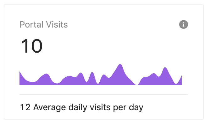
We will use MiniArea component in ChartCard and it looks like as follows:
MiniBar Component
import React from 'react';
import { Chart, Interval, Interaction } from 'bizcharts';
import './chart.less';
import autoHeight from './autoHeight';

function MiniBar(props) {
  const data = [
    { year: '1951 year', sales: 38 },
    { year: '1952 year', sales: 52 },
    { year: '1956 year', sales: 61 },
    { year: '1957 year', sales: 45 },
    { year: '1958 year', sales: 48 },
    { year: '1959 year', sales: 38 },
    { year: '1960 year', sales: 38 },
    { year: '1962 year', sales: 38 },
    { year: '1963 year', sales: 10 },
    { year: '1965 year', sales: 90 },
    { year: '1966 year', sales: 80 },
    { year: '1967 year', sales: 20 },
    { year: '1968 year', sales: 80 },
    { year: '1970 year', sales: 50 },
  ];

  return (
    <div style={{ paddingTop: '20px' }}>
      <Chart autoFit pure data={data}>
        <Interval position="year*sales" />
        <Interaction type="element-highlight" />
        <Interaction type="active-region" />
      </Chart>
    </div>
  );
}

export default MiniBar;
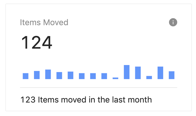
We will use MiniBar component in ChartCard and it looks like as follows:
Adding ChartCards to Dashboard
We can display similar information or visual charts in the ChartCards and we can display them in the Dashboard as follows:
import React from 'react';
import { Card, Col, Row, Layout, Tooltip } from 'antd';
import { InfoCircleFilled, CaretUpFilled } from '@ant-design/icons';
import ChartCard from '../../component/chart/ChartCard';
import MiniArea from '../../component/chart/MiniArea';
import MiniBar from '../../component/chart/MiniBar';
import MiniProgress from '../../component/chart/MiniProgress';
import { movementSummary, visitSummary } from './Constants';
import ProductBarChart from '../../component/chart/ProductBarChart';
import ProductPieChart from '../../component/chart/ProductPieChart';

function Dashboard() {
  const topColResponsiveProps = {
    xs: 24,
    sm: 12,
    md: 12,
    lg: 12,
    xl: 6,
    style: { marginBottom: 24 },
  };

  return (
    <>
      <Row gutter={24} type="flex">
        <Col {...topColResponsiveProps}>
          <ChartCard
            bordered={false}
            title="Total Items"
            action={
              <Tooltip title="Total number of items">
                <InfoCircleFilled />
              </Tooltip>
            }
            loading={false}
            total={12}
            footer={
              <>
                <span className="boldText">{13}</span> Items added in the last{' '}
                <span className="boldText">7</span> days
              </>
            }
            contentHeight={46}
          >
            <div style={{ position: 'absolute', bottom: 0, left: 0 }}>
              Weekly Changes
              <span className="trendText">{14}%</span>
              <CaretUpFilled style={{ color: '#52c41a' }} />
            </div>
          </ChartCard>
        </Col>
        <Col {...topColResponsiveProps}>
          <ChartCard
            bordered={false}
            title="Portal Visits"
            action={
              <Tooltip title="Total number of active users in the last month.">
                <InfoCircleFilled />
              </Tooltip>
            }
            loading={false}
            total={10}
            footer={
              <>
                <span className="boldText">{12}</span> Average daily visits per
                day
              </>
            }
            contentHeight={46}
          >
            <MiniArea color="#975FE4" data={visitSummary} />
          </ChartCard>
        </Col>
        <Col {...topColResponsiveProps}>
          <ChartCard
            bordered={false}
            title="Items Moved"
            action={
              <Tooltip title="Item movement in the last year.">
                <InfoCircleFilled />
              </Tooltip>
            }
            loading={false}
            total={124}
            footer={
              <>
                <span className="boldText">{123}</span> Items moved in the last
                month
              </>
            }
            contentHeight={46}
          >
            <MiniBar data={movementSummary} />
          </ChartCard>
        </Col>
        <Col {...topColResponsiveProps}>
          <ChartCard
            bordered={false}
            title="Item Returns"
            action={
              <Tooltip title="Percentage of returned items.">
                <InfoCircleFilled />
              </Tooltip>
            }
            loading={false}
            total={10 + ' %'}
            footer={
              <>
                <span className="boldText">{12}</span> Items in the last year
              </>
            }
            contentHeight={46}
          >
            <MiniProgress
              percent={10}
              strokeWidth={16}
              color="#13C2C2"
              target={100}
            />
          </ChartCard>
        </Col>
      </Row>
    </>
  );
}

export default Dashboard;
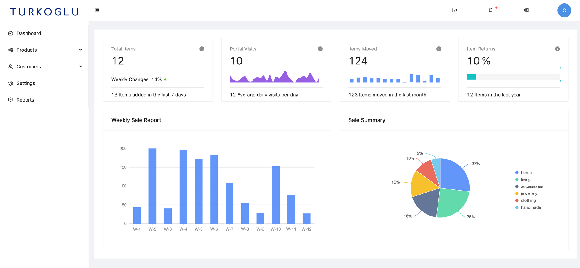
Now the Dashboard page looks like as follows:
BarChart Component
import React from 'react';
import { Chart, Interval, Tooltip } from 'bizcharts';
import { Card } from 'antd';

const barData = [
  { x: 'W-1', y: 44 },
  { x: 'W-2', y: 201 },
  { x: 'W-3', y: 41 },
  { x: 'W-4', y: 197 },
  { x: 'W-5', y: 173 },
  { x: 'W-6', y: 184 },
  { x: 'W-7', y: 109 },
  { x: 'W-8', y: 55 },
  { x: 'W-9', y: 28 },
  { x: 'W-10', y: 153 },
  { x: 'W-11', y: 76 },
  { x: 'W-12', y: 27 },
];

function ProductBarChart() {
  return (
    <Card bordered={false}>
      <Chart
        height={250}
        autoFit
        data={barData}
        interactions={['active-region']}
      >
        <Interval position="x*y" />
        <Tooltip shared />
      </Chart>
    </Card>
  );
}

export default ProductBarChart;PieChart Component
import React from 'react';
import { Interaction, PieChart } from 'bizcharts';
import { Card } from 'antd';

const pieData = [
  {
    type: 'home',
    value: 27,
  },
  {
    type: 'living',
    value: 25,
  },
  {
    type: 'accessories',
    value: 18,
  },
  {
    type: 'jewellery',
    value: 15,
  },
  {
    type: 'clothing',
    value: 10,
  },
  {
    type: 'handmade',
    value: 5,
  },
];

function ProductPieChart() {
  return (
    <Card bordered={false}>
      <PieChart
        forceFit
        height={250}
        data={pieData}
        radius={0.8}
        angleField="value"
        colorField="type"
        label={{
          visible: true,
          type: 'outer',
          offset: 20,
          formatter: val => `${val}%`,
        }}
      >
        <Interaction type="element-single-selected" />
      </PieChart>
    </Card>
  );
}

export default ProductPieChart;
These components are just some example usage of chart components of Bizchart. We can display them in the dashboard with a 1/2 row size card. Right after the first row in the Dashboard page we can add these components as the second row:
<Row gutter={24} type="flex">
  <Col span={12}>
    <Card title="Weekly Sale Report">
      <ProductBarChart />
    </Card>
  </Col>
  <Col span={12}>
    <Card title="Sale Summary">
      <ProductPieChart />
    </Card>
  </Col>
</Row>Now the Dashboard page looks like as follows:
See the commit for the changes: 22f2798.